From Heat Maps to Numbers: Why Qualitative Risk Scoring Fails
Why the qualitative grid is losing ground to quantitative methods — and what to replace it with.
The classic risk heat map is the most successful piece of risk management iconography ever produced.
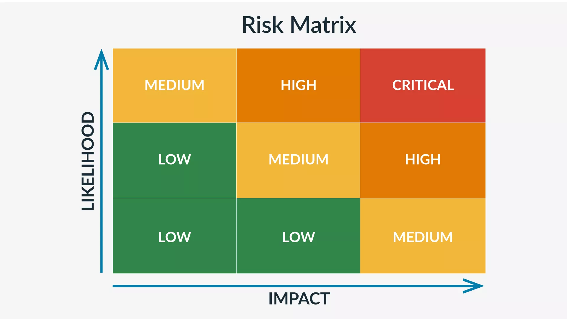
You get likelihood up the side, impact across the bottom, fifteen (or twenty or twenty-five cells) coloured green through amber to red, the dot for each risk placed by collective judgement.
It is easy and it is everywhere — in board reports, regulatory submissions, internal audit papers and in many vendor risk dashboards.
It is also, judged by what risk analysis is really for, defective in ways that are fundamentally structural in nature.
This article is the case against that long running trend. It is not an article against caring about risk, not against expert judgement, not against the value of a visual summary, but simply against treating the risk heat map as a risk analysis when it is in fact, at most, a risk display.
It is the foundational argument for everything else in the risk quantification pillar.
As always you should remember this is not legal or actuarial advice.
The four structural problems with qualitative risk scoring.
The objections to qualitative risk scoring are not aesthetic. They are mathematical, and they have been documented at length in the decision-science literature for decades. Four of them matter most.
Problem one: the outputs cannot be added or compared
The fundamental issue is that "high," "medium," and "low" are not numbers. They are labels for ordered categories. Ordered categories can be ranked, but they cannot be arithmetically combined.
What this means in practice: an organisation with two "high" risks does not have twice the risk exposure of an organisation with one "high" risk. It cannot. The arithmetic does not exist. "High plus high" has no defined result. Similarly, an organisation with one "high" risk and three "medium" risks cannot be compared on its total risk exposure to an organisation with three "highs" and no mediums — there is no operation that produces a meaningful comparison.
The result is that a heat map containing twenty risks cannot tell you what your overall risk is. It can only tell you that some of the risks are worse than others, in a particular ordering, on a particular axis. The information content is far thinner than the visual suggests.
Problem two: the categories are not consistent across analysts
A common defence of qualitative scoring is that it is easier than quantification, because analysts can simply use their judgement. This defence inverts the truth. When analysts use "high," "medium," and "low" without numerical definitions, the same risk is scored differently by different people, and the same person scores it differently on different days.
The decision-science research on this is depressing and conclusive. When analysts are asked to translate "high likelihood" into a numerical probability, the answers span ranges that overlap heavily. One person's "high likelihood" is 30%; another's is 90%. One person's "medium impact" is €100,000; another's is €10 million. The categories have the appearance of shared meaning and the reality of private interpretation.
The grids that attempt to fix this by adding definitions — "high = greater than 50% in a year, impact greater than €1M" — improve the situation only modestly, because the same definitional ambiguity recurs at every boundary. Is a 55% likelihood a high or a very high? Is a €900,000 loss medium or high? The cliff edges create gaming pressure and inconsistency that quantitative ranges, by being continuous, simply do not have.
Problem three: the cell colours mislead about magnitude
The standard heat map's colour gradient is psychologically powerful and analytically misleading. The cells in the top-right corner — high likelihood, high impact — are red. The cells in the bottom-left — low likelihood, low impact — are green. This communicates an ordinal ranking that aligns with intuition.
But the colours are equally spaced visually, while the underlying values are not equally spaced quantitatively. A "high impact" risk may be 10× or 1,000× the magnitude of a "medium impact" risk, depending on the scale. The colour gradient hides this. A risk that is genuinely catastrophic — capable of bankrupting the firm — is in the same red cell as a risk that would cost a difficult quarter. Both are "red."
The empirical research on this — notably Tony Cox's 2008 paper "What's Wrong with Risk Matrices" — established that under realistic distributions of likelihood and impact, the heat map's rankings can be wrong substantial portions of the time. Risks that should be ranked higher are placed in lower-coloured cells, and vice versa. This is not a tuning problem with a particular grid. It is a structural problem with the colour-and-cell approach.
Problem four: the outputs cannot enter financial decisions
This is the most consequential problem in practice. Real decisions — control investments, insurance coverage, capital allocation, board-level risk acceptance — are financial. They involve comparing costs to expected loss reduction, or comparing risk against risk appetite stated in currency.
A heat map produces no input for any of these decisions. "We have three reds and seven ambers" cannot be balanced against "the proposed €400,000 control investment." There is no operation that converts the left side into the right side's units. The only way the conversation can proceed is for someone — usually the CISO, often informally — to silently retranslate the colours into financial estimates inside their own head, and then make the case to the CFO.
This silent retranslation is happening already, in every organisation that uses heat maps to inform real decisions. The quantification movement is not introducing financial analysis into risk decisions; it is making explicit and rigorous what was already happening, badly, in private.
The honest defences of qualitative scoring
A fair treatment requires acknowledging the cases where qualitative scoring is defensible. There are three.
Triage at very low cost. For a quick first pass over a large number of identified risks — does this even warrant analysis — qualitative ranking can be a sensible filter. The five-by-five grid as a triage step before deeper analysis is a reasonable use. The failure is not using qualitative scoring at all; it is treating its output as a final answer.
Risk identification. The exercise of producing a heat map — the conversations, the workshops, the surfacing of risks the organisation had not consciously articulated — has value independent of the output. The fact that the artefact is a heat map is incidental; the conversation is the work.
Communication artefact. A heat map can be a serviceable communication device for an audience that cannot or will not engage with distributions. It is a display, downstream of an analysis. The error is treating it as the analysis itself.
What is not defensible is using qualitative scoring as the only tool, for consequential decisions, with no acknowledgement of its structural limitations.
What replaces it — the minimal alternative
Moving from heat maps to quantification does not require a probabilistic-modelling team. The minimal alternative is small enough that any organisation already doing qualitative scoring can adopt it.
Replace categories with ranges. Instead of "high likelihood," ask analysts for a 90% confidence interval: "between 10% and 60% chance of occurring in the next year." Instead of "high impact," ask for "between €500,000 and €5 million if it occurs." Ranges carry uncertainty honestly and are mathematically combinable.
Use calibrated estimation. Train analysts to produce intervals that match their actual uncertainty. The training is short — typically a day or less — and has reproducible effects. A calibrated analyst's 90% intervals contain the truth about 90% of the time; an uncalibrated analyst's contain it far less. We cover the training in Calibrated Estimation: Training Analysts to Quantify Under Uncertainty when published.
Simulate the combinations. Use Monte Carlo simulation to combine the input ranges into output distributions. The mathematics is identical regardless of organisational size — a spreadsheet runs 10,000 iterations of the combined model in seconds. See Monte Carlo Simulation for Cyber Risk.
Report distributions, not points. "Annual loss is expected to be approximately €4 million, with a 90% confidence interval of €1.2 million to €12 million, and a 5% chance of exceeding €20 million" is the kind of statement that supports a financial decision and a board conversation. Reporting a point estimate ("€4 million") without the interval is the new mistake to avoid.
The full methodological foundation is in the pillar's central frameworks: FAIR Methodology Explained and Hubbard's Approach to Cyber Risk Quantification.
The transition path for an organisation already using heat maps
For organisations with existing heat-map practice, the move to quantification is not a rip-and-replace. A workable transition:
- Keep the heat map as a triage / communication layer. Use it for the first pass and for board-level visual summary. Do not pretend it is more than that.
- Pick the top five to ten risks for quantification. The risks the heat map identifies as most consequential are the ones where the heat map is most likely to mislead. Run those through a quantitative analysis.
- Calibrate the analysts. A day of calibration training for the people producing the estimates. Measurable, durable improvement.
- Run the quantitative analysis in parallel. Compare the rankings. Where they agree, the heat map was usefully approximating the underlying numbers. Where they disagree, investigate why — the quantitative analysis is almost always more defensible.
- Phase out reliance on the heat map for decisions. As the quantitative analysis matures, the heat map drifts to its proper role — visual summary downstream of the analysis, not the analysis itself.
What regulators actually expect
A practical note, because the regulatory motivation for this transition matters. None of GDPR, NIS2, or DORA specifies the methodology, but all three increasingly probe the basis for risk decisions.
A NIS2 competent authority asking why a particular control was sized the way it was, in the context of Article 21(1) proportionality, expects a defensible answer. A heat map can provide the ranking but not the justification. A quantitative analysis with calibrated inputs, by contrast, supports the proportionality memo with explicit reasoning. The same logic applies to DORA's annual ICT risk assessment under Pillar 1 — see DORA ICT Risk Management Framework Explained — and to GDPR DPIAs for high-risk processing.
The shift to quantification is not a regulatory mandate. It is a structural advantage for organisations that adopt it, because it makes their compliance evidence stronger across all three regimes simultaneously.
Frequently asked questions
Are heat maps banned by any regulation? No regulation bans them. But regulators increasingly probe the underlying analysis, and a heat map is no longer a defensible standalone risk analysis.
Is quantification only for large organisations? No. The minimal version — calibrated ranges plus spreadsheet Monte Carlo — is accessible to organisations of any size. The barrier is methodological, not resourcing.
Don't quantitative methods just hide assumptions in numbers? They make the assumptions explicit. A heat map hides the assumptions inside the analyst's head where they cannot be challenged. A quantitative model puts them on the page where they can be.
What about risks with no data? Calibrated expert estimation is the method specifically for this case. Hubbard's research demonstrates that calibrated analysts produce reliable interval estimates even where empirical data is sparse.
Doesn't quantification produce false precision? Only if reported badly. Quantification reports distributions — ranges, not point estimates. A wide range honestly stated is more credible than a precise number falsely confident.
Can I keep using heat maps at the board level? Yes, as a visual summary downstream of the analysis. The error is treating the heat map as the analysis.
The bottom line
Three takeaways.
- The heat map has four structural problems. Its outputs cannot be added, are inconsistent across analysts, mislead about magnitude, and cannot enter financial decisions.
- The minimal alternative is accessible. Calibrated ranges plus spreadsheet Monte Carlo gets any organisation past the structural problems.
- Quantification is a regulatory advantage, not a regulatory burden. It strengthens the evidence base under NIS2, DORA, and GDPR simultaneously.
For the frameworks that make this practical, see FAIR Methodology Explained and Hubbard's Approach.
Sources & further reading
- Tony Cox — "What's Wrong with Risk Matrices?" (2008), Risk Analysis
- Doug Hubbard — The Failure of Risk Management (2nd edition); How to Measure Anything in Cybersecurity Risk (2nd edition, with Richard Seiersen)
- The Open Group — Open FAIR Body of Knowledge
- Decision-science literature on probability calibration (Tetlock, Kahneman et al.)